

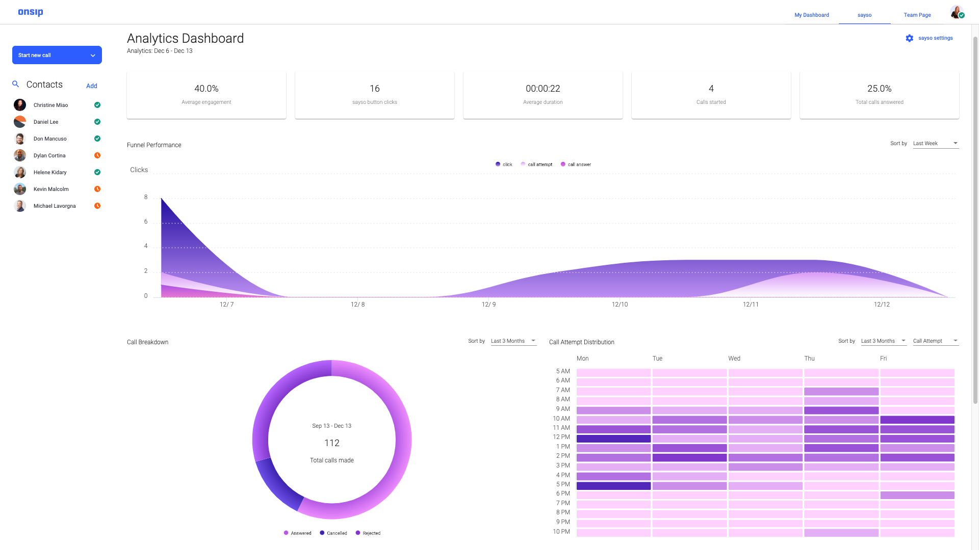
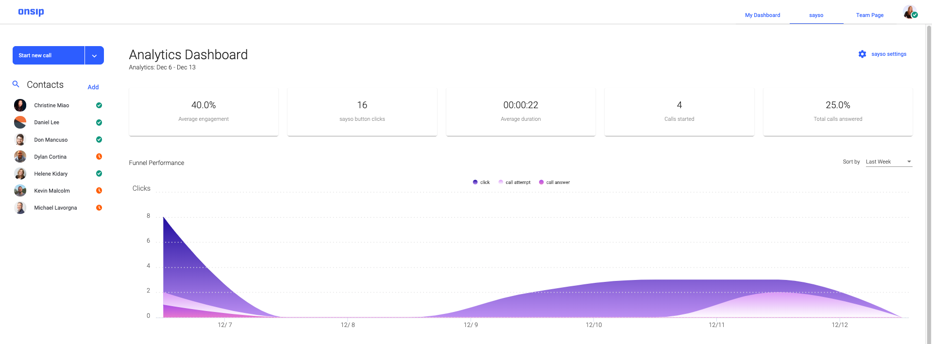
We’re happy to announce that the sayso analytics dashboard is live for all customers! You can now see the various breakdowns of your sayso call metrics, including overall stats, funnel performance, call breakdown, and a distribution heat map, all on one page. You can view further details by hovering your mouse over any section of the color-coded areas.
You reach the dashboard through the OnSIP app, via “sayso” in the top navigation.
It’s one thing to build an innovative tool; it’s another to follow through on its usefulness. Our goal behind building this dashboard is to provide our sayso customers the kind of data that can help them tailor sayso to their exact needs.
For example, your average engagement percentage on the top row is fancy analytics speak for the percentage of site visitors who actually click the sayso button. If it’s much higher than you expected, you might think about adding more reps or topics to your current settings. The funnel performance gives you a one-glance overview of your busiest days, whereas the heatmap breaks your metrics down into an hour-by-hour analysis.
You might use the heatmap to find out if there are any particular times when sayso activity is particularly high. If Monday post-lunch lights up like Times Square, you could rearrange various meeting schedules to make sure reps are available to answer calls.
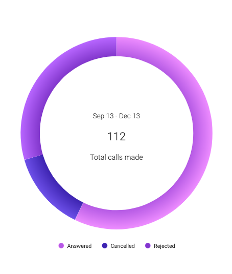
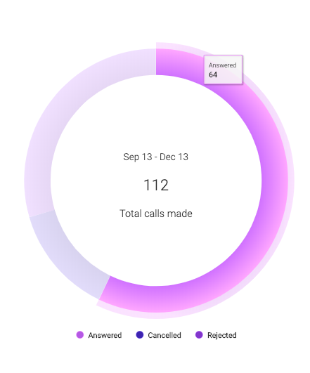
The call breakdown section lets you know if more calls are rejected than answered—the type of information on which you can analyze and act. It can help you figure out that some reps may be busier and might need to be removed from sayso availability. Or in terms of overall performance, you can see if there’s a high number of visitors clicking the sayso button to check it out but canceling the call before it’s answered.
Timeline Options
The top row and funnel performance are grouped together, while call breakdown and distribution are individual. You can sort your stats from one of these three options:
- Last Week
- Last Month
- Last 3 Months
Top Row
Flat stats for the time period selected:
- Average engagement percentage (number of sayso button clicks divided by the number of times sayso is seen on your site)
- sayso button clicks
- Average duration of calls
- Number of calls started
- Percentage of total calls answered
Funnel Performance
Total clicks in the time period selected, visually broken down into clicks, call attempts, and calls answered. Hovering over any particular day will give you the specific breakdown of clicks, call attempts, and calls answered.
Call Breakdown
Total calls made in the time period selected, visually broken down into calls answered, canceled, and rejected. Hovering over each section of the graph gives you the specific number for that call type.
Distribution Heat Map
Curious when your busiest times are during the week? Or when the most calls go unanswered? This heat map shows the distribution for one of seven metrics:
- sayso button load (how many times the button is seen by site visitors)
- sayso button click (button clicks, whether or not a call is made)
- Call attempt (calls started)
- Call answer (successful connections)
- Call cancel (calls started then canceled by the site visitor before the rep picks up)
- Call reject (calls initiated but not answered)
- Call end (calls initiated, answered, and successfully ended)
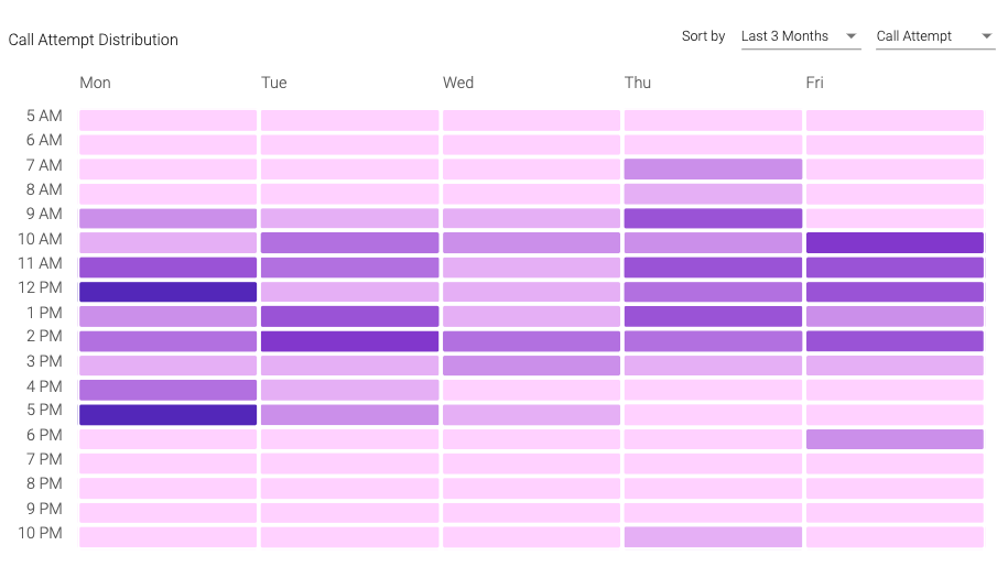
The map covers 24 hours and 7 days of the week, but you can zoom in on any area by highlighting the cells with your cursor. To zoom back out, click the “Reset Zoom” button on the top right of the heat map.
Note: The analytics kick in once you’ve had five sayso calls.